« No Professionals Need Apply | Main | My Stodgy Print Portfolio »
26.10.08
Your Stodgy Print Portfolio
A few print and branding samples, 2001-2008. If you want interaction, web and Flash, you will need to go another link.
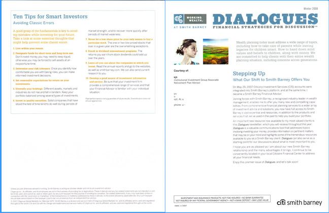
Above: sample front/back spread for a customizable 8- or 16-page client newsletter, 2007. Part of an online web-to-print project for which I created the Quark and xml templates. Clients could select articles, images, and other elements, then review a pdf before pulling the trigger and ordering (say) 10,000 copies to be maillisted out next Tuesday.
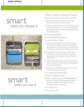
Detail of an FMA Card collateral piece for SB Advertising, early 2005.
If the design schema looks vaguely familiar, that could be because it was reflecting the neat-as-pin tiny-type layouts then current in web design. Case in point: the Movable Type blog you're looking at, which dates from the same period.
The style worked for blogs and posters and advertisements, but not for newsletters, which had to look messy and interesting so people would read the copy. E.g., the Accel piece below:
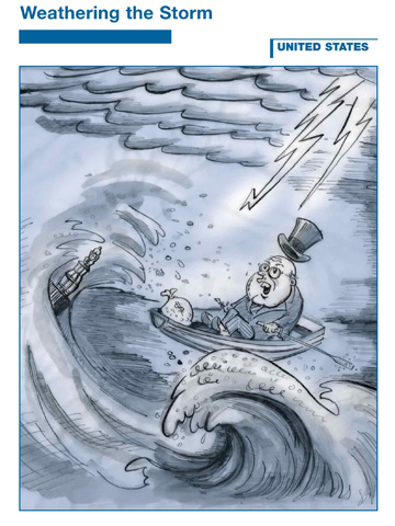
One of a series of covers I did for bond-research books, 2001-2006:
This looks very old:
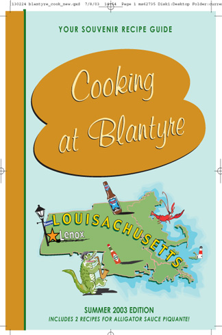
This was just silly. As they said in The Twilight Zone, It's a Cookbook!
Detail of elaborate display, Investment Banking in Silicon Valley:
One of many web icons and branding elements I created, replaced, reworked or whatever:

Something about Microsoft and SCO vs Linux and Open Source?

I created 30 or 40 logos for Smith Barney alone. This one was current for a couple of years, then we flipped the corporate ID and used a different one for the next two years:

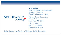
Business cards. A bar, a bank, a brokerage:

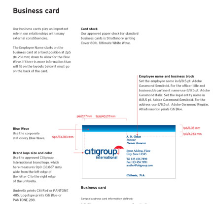
Bits of corporate-identity branding guides I created with SB Advertising and the Sterling Group:

ANCIENT CURIO. I thought I had lost all my old designs and press cuttings in The Fire, but I was wrong. A few things still bubble up on occasion. Below, here's something positively ancient, from the early 90s, when I was a working journalist on the West Coast and moonlighted as an editorial illustrator. This is supposed to be Michael Lutin, Vanity Fair's camp astrologer.
Posted by Margot at 26.10.08 16:55
Trackback Pings
TrackBack URL for this entry:
http://www.gallerynews.com/mt/mt/mt-tb.cgi/2
Listed below are links to weblogs that reference Your Stodgy Print Portfolio:
» Casino 495ed98cf0 from Casino 495ed98cf0
Casino 495ed98cf0 [Read More]
Tracked on 03.01.09 07:45